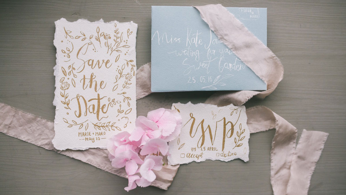
Are you wondering how to design your wedding invitations if you aren’t a pro designer? It can be tricky but not impossible.
Your wedding stationery is an integral element of the event aesthetics, showcasing your unique personality and style.
Designing your invitations may seem like an art, but it’s actually more of a science. You should use your creativity but also follow graphic design best practices.
Your invitations must not be simply visually appealing. They should be readable and consistent with your wedding theme.
You need to consider the colors, fonts, shapes, sizes, printing techniques, and paper type. But it’s all worth the time and effort when you finally keep your invitations in your hands.
Table of Contents [show]
Consider Your Wedding Theme
The looks matter when it comes to wedding stationery. Your wedding invitations set the tone of the entire event and draw up excitement. They should fit your wedding theme to create a consistent impression.
Well-designed invitations show your guests how to dress and what to expect from your wedding without even mentioning the theme or the dress code.
Even the most traditional weddings have a theme. A theme doesn’t have to revolve around your hobbies, a movie, or an era – it can be inspired by something simple like the season or your venue.
Think about the small details that comprise your wedding atmosphere. Incorporate your wedding flowers, shapes, colors, and textures into your wedding invitation design.
For instance, if you have a tropical summer wedding at the beach, choose invitations with flamingoes and palm leaves. If you have a winter wonderland themed wedding, pick white invitations with glitter that channel the event vibes.
Sometimes, determining the theme isn’t as simple. Consider the tone of your event. Is it formal or laid-back? Do you prefer glamour or rustic style?
Once you define your wedding theme, pick two to four colors to keep your invitations neat and readable. Balance bold hues with pastels or neutrals. You may use the color wheel to mix and match colors correctly.
Draw Inspiration
Many people believe that you need the talent to be a designer, but graphic design isn’t art. It’s based on specific rules, and you can create wonderful DIY wedding invitations if you learn the basics and draw enough inspiration.
After determining your wedding theme and picking your color scheme, start researching wedding invitation ideas online. You may use Pinterest, Google image search, Instagram, and pretty much any other platform to find ideas.
Note that the variety of beautiful wedding invitation designs is overwhelming, and you likely won’t be able to pick your favorites from the first go. Bookmark ideas you like and get to them later. Don’t forget to discuss them with your partner!
Apart from searching for ready wedding invitation ideas, you may draw inspiration from pictures associated with your wedding theme.
For example, find scenic winter nature pictures for a seasonal December wedding and take note of distinct elements and colors to incorporate into your invitations.
Use Templates
If you don’t have any design experience, using wedding invitation templates may be the best option.
It eliminates the hassle of coming up with fresh ideas while ensuring your invitations will look perfect and follow design best practices.
The problem with DIY wedding invitations is that not everyone can match colors, shapes, and fonts properly. Furthermore, it requires some design software skills.
Using wedding invitation templates is straightforward – find one you like, download it, customize it, and print it.
Some invitations only require you to enter basic personal details, while others allow you to fully customize the colors and fonts.
You may pay for a template, but frankly, it isn’t necessary with such a wide variety of free options online. You can choose among thousands of stunning designs in any style.
Perhaps, the only drawback of using a template is that it doesn’t feel as personal. However, who cares if another couple has the same invitations if you’ve never even met them?
Don’t Go Overboard
Every couple wants their wedding to be extraordinary. Unfortunately, “extraordinary” in design often toes a narrow line with tacky. When designing your invitations, don’t go overboard and avoid overcrowding the design.
Keeping the design simple isn’t even about the look – that’s a matter of personal preference.
It’s merely about readability and comprehension. The invitations should convey the information clearly and not overwhelm the recipients.
Start from the outside and move towards the center. Pick your base color, borders, and primary text, and then add smaller, less important details which you can remove if the design feels too much.
Font
Typography is an entire niche in the design industry that’s too complex even for some professional designers. There’s a science to matching, arranging, and placing words in an appealing, readable manner.
Many couples opting for DIY wedding invitations focus on the colors and shapes, forgetting about the fonts. Meanwhile, they play a vital role in the impression your guests will get from your invitations.
Understand typeface styles before you start your perfect wedding invitation font search.
Serif fonts, such as Times New Roman, have plenty of short lines at the ends of letters. In contrast, sans serif fonts don’t have such lines – think Aerial or Calibri.
Then, there are also script fonts that resemble cursive handwriting and display fonts that are highly graphic and not always readable.
Pick a font style that fits your wedding aesthetics. If you have a traditional wedding in retro style, serif fonts are a perfect option.
On the other hand, script fonts are ideal for rustic weddings because they give a rough, natural feeling.
However, picking the typeface style isn’t even the main problem – it’s matching fonts. The golden rule is to mix and match fonts from the same family but with different weights, sizes, cases, or colors.
You may also play with kerning, which is the spacing between letters. Varying kerning is a great way to define the text hierarchy, but it requires some design experience.
Most importantly, ensure your invitations are readable. Don’t use display fonts for the primary body of text – stick with something more comprehensible.
Size & Paper
Invitations come in all shapes and sizes, but the standard wedding invitation format is 5×7 inches. This size allows enough room for all the necessary information and saves you money on postage because it only requires one forever stamp.
However, some couples choose heart-shaped, square, or elongated invitations. Note that oddly shaped wedding invitations may require extra postage because they don’t meet the standard letter requirements.
Paper is an essential consideration when making wedding invitations yourself. Always go for a thick, heavyweight paper for a more luxurious, substantial feeling.
Furthermore, thick card paper is better resistant to abuse like bending and scratching.
Choose wedding invitation paper with a weight of 250 grams or heavier. You may print your invitations on smooth matte card paper or choose an unusual designer paper with texture.
You may choose between glossy, linen, metallic, cross-hatched, and numerous other effects to make your invitations more special. Such paper is available at printshops, art stores, or online.
Alternatively, you may choose costlier cotton fiber or wood-grain paper for a rustic touch. As for wedding invitation printing techniques, consider embossing, engraving, foil stamping, thermographic printing, and standard flat printing.
Note that poor printing quality can ruin the best design, and a well-chosen paper and printing technique can make a simple design shine. Therefore, it’s best to save on the designer but invest extra in professional printing.
Wording
Wording and design go hand in hand in creating your invitation aesthetics. Furthermore, you should ensure your invitations have enough space to fit all the necessary information.
A standard wedding invitation card includes the couple’s names, occasion, date, time, and location. Additional details such as dress code, theme, and RSVP are typically mentioned on a separate card.
However, the rules aren’t set in stone. You can make double-sided invitations or ditch extra information entirely if you don’t find it necessary.
Choose the Software
The times when stationery had to be designed by hand are long gone. Even if you’re extra crafty, you’ll likely hate the idea of DIYing your invitations after drawing 100 cards, so choosing the right design software is vital.
Consider your computer capabilities and skills when choosing the wedding invitation design software. Professional designers use Adobe Photoshop and similar software, but it requires intermediate or higher skills.
Thankfully, you can choose among numerous simple design software that streamlines the process of creating custom wedding invitations, for example, Canva.
Such software doesn’t require any design skills, and you can customize the invitations even from your phone.
Match the Inserts & Envelopes
Some couples opt for simple one-sided invitations only containing essential information.
That’s a valid option if the budget is tight or you’re concerned about environmental impact, but traditional wedding invitations come with reception cards, RSVP response cards, and two envelopes.
If you choose the whole set, match the add-on design with your main invitation cards. The style should be consistent – use the same colors, shapes, formats, fonts, and paper type for all stationery.
Even the outer envelope is an element of your invitation design. You can always pick standard white envelopes, but consider fancier options from metallic or colorful heavyweight paper for a luxurious touch.


No Comments Add one
Leave a Comment